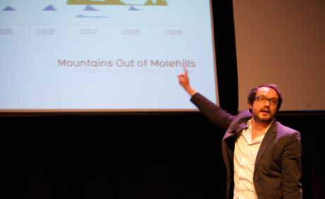
Data journalist will talk about understanding data through visualisation.
Data-journalist and infographics designer David McCandless will deliver a Gates Distinguished Lecture next week on how visualising data can help us to find interesting patterns and connections.
McCandless’ lecture will take place on 8 March. He has pioneered novel methods to visualise the intricacies hidden within convoluted datasets, including complex political statistics, information about climate change and trends in pop music and contemporary lifestyle. “It feels like we’re all suffering from information overload, or data glut,” he says. “The good news is that there is a solution to that: using our eyes more.”
In his new book, Information is Beautiful (or The Visual Miscellaneum in the United States), McCandless constructs ‘information landscapes’ that deconstruct subjects such as swine flu, the US and UK political system, and scientific evidence for health supplements. He says: “Visualising information [helps reveal] the patterns and connections that matter […] so that [data] makes more sense, or tells a story, or allows us to focus only on the information that’s important.”
“McCandless’ work is both captivating and visually interactive,” says Nathan Benaich, External Officer of the Gates Scholars Council and organiser of the Distinguished Lecture Series. “His contributions to over 40 publications worldwide, including The Guardian and Wired magazine, extract new knowledge and unravel insights into data in a user-friendly fashion that is accessible to all.” Examples of McCandless’ published information visualisations can be found on his personal blog, InformationIsBeautiful.net.
The Lecture, which is open to all members of the University and their guests, begins at 6:30PM (GMT) on 8 March (Tuesday) in the Cripps Court Auditorium of Magdalene College, Cambridge.


